11
SCREENS · FULL LIFECYCLE
A body-recomposition tracker built on one insight: this looks like a tracking problem, and it's really a retention problem. Self-initiated — research, product strategy, UX, UI, and a clickable prototype.
Body recomposition feels like a long road to nowhere. The scale bounces between the same five pounds no matter how consistent you are — because the scale can't see muscle replacing fat. The real proof lives in progress photos buried in a camera roll, measurements scattered in a notes app, and trends nobody connects.
Existing trackers are built around weight. So people quit programs that were actually working. They just couldn't see it.
I know this because it was me. During a recomposition phase I had photos in my camera roll, measurements in Notes, and weight in a separate tracker — and I still couldn't tell if anything was working. The scale said no. My body said something else. Nothing connected the two.
Nora starts and stops diets and walking programs about once a month. Her consistency is tied directly to the scale: when the number drops she keeps going; when it stalls she's back to old habits within weeks.
Her real problem isn't effort. It's that the only instrument she's measuring with is the one that lies during recomposition.
This reframed the entire project: Recomp isn't a tracker. It's a motivation engine that surfaces the progress the scale can't. That insight drove every major decision that followed.
Before designing anything I tore down the four tools people actually use, looking for where each fails a recomper specifically.
Powerful calorie and weight logging, but progress photos are buried beneath nutrition data, and measurements, photos, and weight never share one timeline. It reinforces the scale obsession that makes people quit.
Beautiful daily-fluctuation smoothing, but the entire trend is weight-based — no measurements, no photos. A recomper learns to trust the exact metric telling them to stop.
Excellent side-by-side comparisons, but measurements and weight never drive insight alongside the images. The user interprets everything themselves — and on a low-motivation day, nobody connects the dots for them.
Fully customizable and holds everything in one place, but no trend detection and nothing links photos to measurements. Maintenance effort climbs while payoff shrinks.
I wrote a strict scope before designing and pressure-tested every feature against one question: does Nora need this to see her progress?
MyFitnessPal owns this. Rebuilding it would bury the actual point of the product.
Scope explosion — and not what Nora needs in order to see progress.
The single most powerful come-back tool, but infrastructure-heavy. v1.5, as the #1 next priority rather than cut forever.
A decision worth highlighting: during scoping I realized my first feature list answered "how does Nora see progress in the app?" but not "what gets her to open it at all?" Those are different problems — and for someone whose failure mode is stopping, the second matters more. That's why Weekly Wins and the streak made the v1 cut. Seeing progress is worthless if she never comes back to see it.
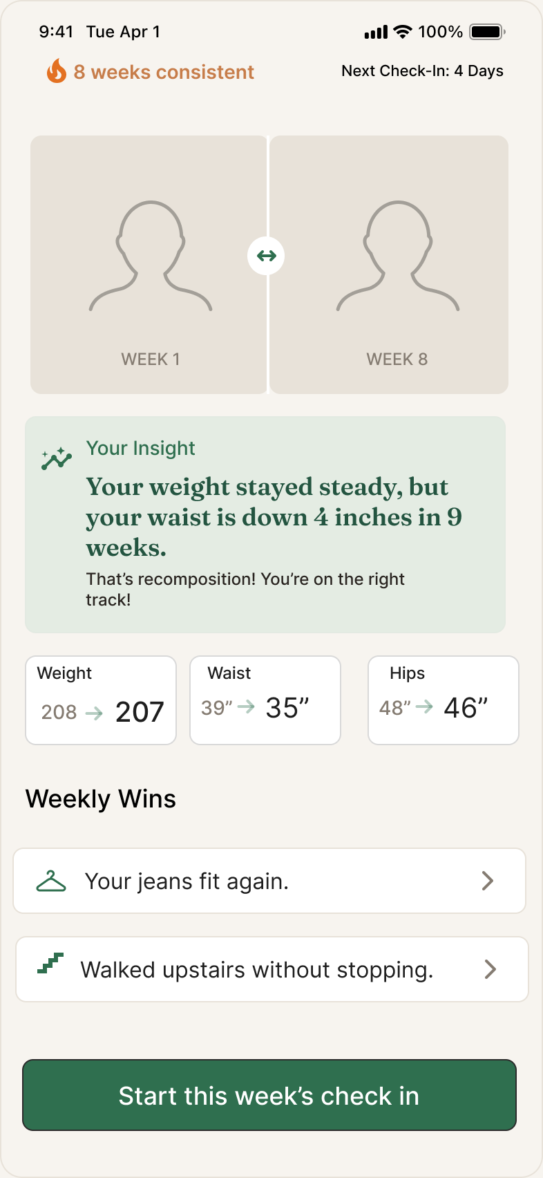

Weight stays — recompers still want it — but it's never the hero. On the dashboard it's one small supporting stat while the photo comparison and measurement trends carry the story. This directly counters the failure mode shared by every competitor.
The most important moment in the app is one sentence: "Your weight stayed steady, but your waist is down four inches in eight weeks. That's recomposition." That's the line that catches Nora on a low day. I treated it like the headline it is — most visual weight on screen, display typeface, the signature emerald.
The weekly check-in ends immediately on a "what's better than last week?" win, with no navigation. The dashboard leads with a streak. Onboarding plants the next check-in date before the user leaves. The whole loop pulls someone back, because retention is the actual problem.
Photo apps fall apart because week-over-week shots are taken at different angles. Recomp shows a faint ghost of last week's photo during capture so the pose lines up. Small feature — but it's what makes the signature comparison actually work.
The weekly ritual has to be effortless or it won't repeat. Last week's measurements are pre-filled so the user adjusts rather than types. The flow never asks for input it can infer.
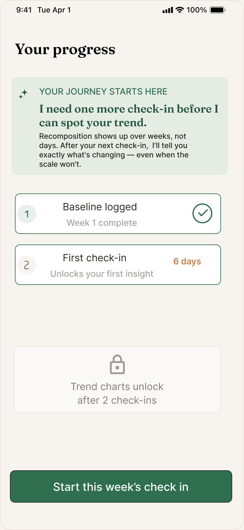
Making "empty" feel like a beginning, not a dead end. Day one is exactly when Nora is most likely to quit — there's no progress to show yet. So the empty states carry the motivation on tone alone. The week-one dashboard shows her baseline photo beside a placeholder previewing where the next one goes. An empty state isn't "nothing here yet" — it's a promise of what's coming.
An AI that admits what it doesn't know. With one check-in logged there isn't enough data for a real insight. A lesser version fabricates one anyway. Recomp's says: "I need one more check-in before I can spot your trend. Recomposition shows up over weeks, not days."
Admitting the limit rather than faking confidence is what makes the insight trustworthy when it does speak — and trust is the whole reason someone believes the app over their scale.

Onboarding hands off to the dashboard; the dashboard starts the weekly check-in; the check-in's payoff returns to the dashboard. A new user can walk the entire product and end up back where they started, ready to do it again.
It runs on a small, deliberate design system — a warm, grounded palette (sand, warm charcoal, and a single emerald accent spent in exactly two places: the primary action, and the companion's voice), a display serif for emotional moments paired with a clean UI sans, and consistent spacing so every screen feels like one product. When a surface is emerald, the companion is genuinely speaking — including when what it has to say is "I don't have enough data yet." Reserving the accent that tightly is what makes the wins land instead of competing for attention.

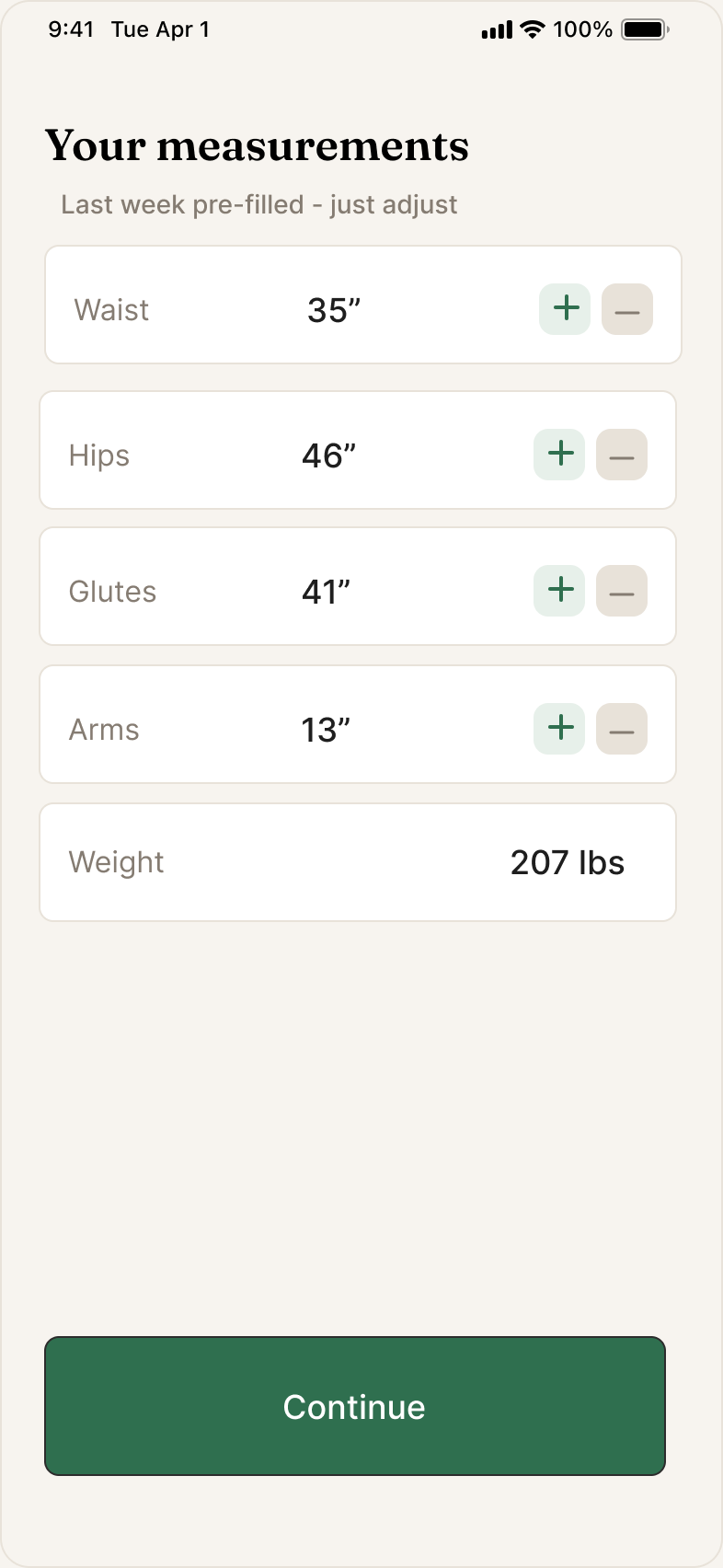
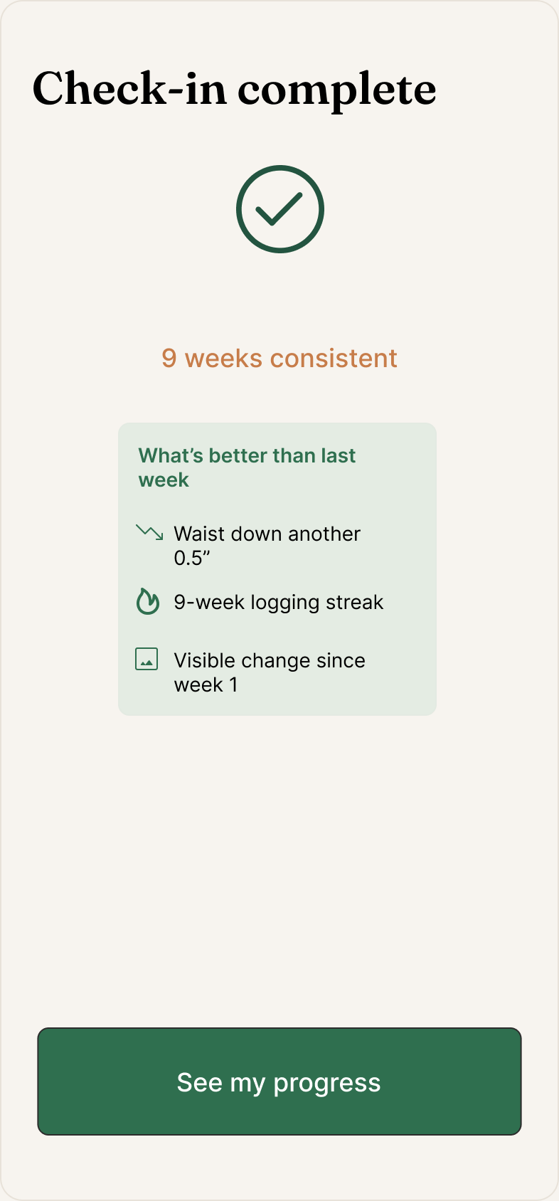
A complete, prototyped product design covering the full lifecycle — onboarding, the weekly check-in, the signature progress dashboard, and the day-one and insufficient-data states most apps ignore — wired into a clickable prototype with a narrated walkthrough.
More important than the screen count is what the design proves: a clear product thesis backed by competitive evidence, scope discipline about what not to build, and a system designed around the real problem (retention) rather than the obvious one (tracking).
What I'd measure next. Designed with specific success metrics in mind, to be validated live: first-check-in completion, week-two retention (the true test of the come-back engine), and check-in completion rate and time (the test of the under-two-minutes goal).
Recomp looks like a tracking problem. It's a retention problem. Naming that correctly changed every meaningful decision.
Scope discipline is a design skill. Deciding what not to build — and being able to defend each cut — did more for this product than any individual screen.
Designing the empty and the honest moments is where maturity shows. The day-one states and the AI's willingness to admit uncertainty aren't glamorous, but they're what make the product trustworthy and humane.